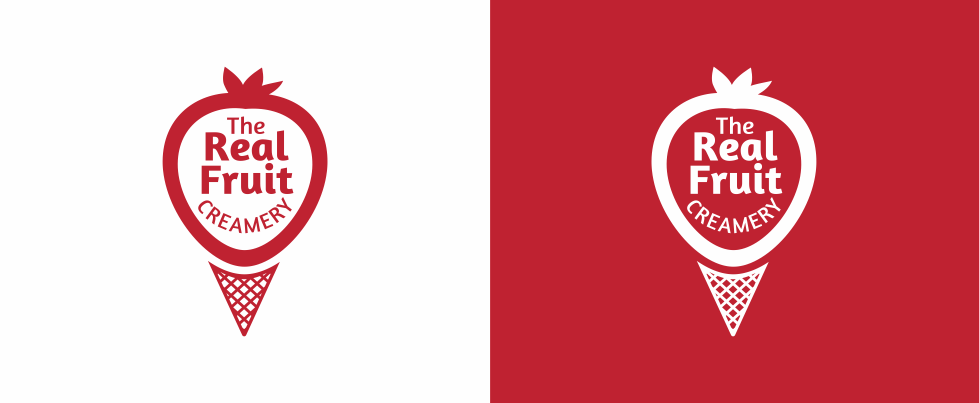
I was set the task to do the The Real Fruit Creamery Logo Design for a new business based in Knutsford, Cheshire. Selling delicious handmade artisan gelato with freshness and flavour at the heart of everything they do, including their signature fruit kebabs. The brief was simple, to create a unique one colour design that encapsulated ice-cream and fruit that could be easily transferred onto packaging, signage and online.

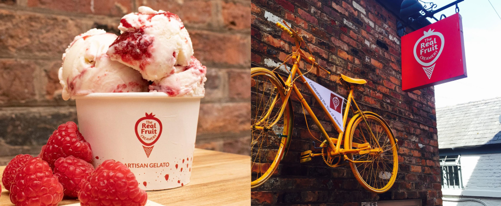
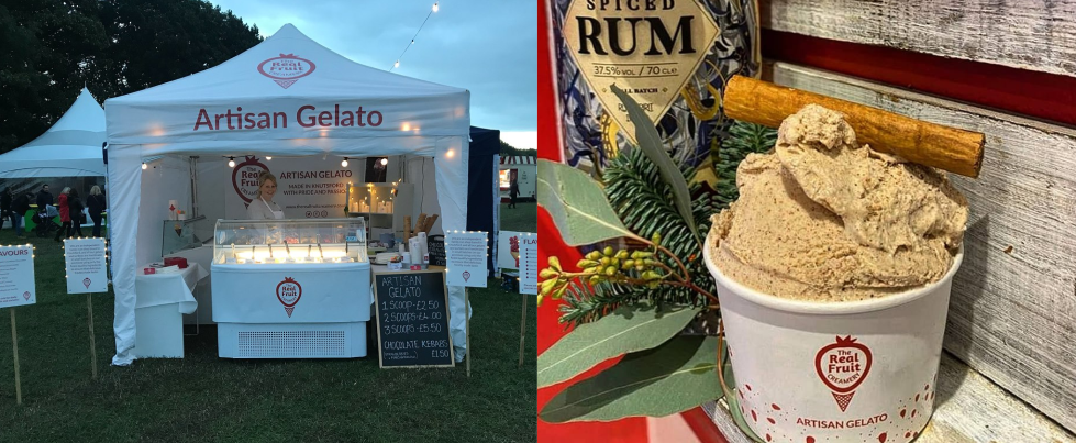
I already had a good vision in my head straight after talking through the brief with the client. I knew I wanted to use a rich berry red for the main logo that can work both on white and in red. The key was to instantly show that it was fruit icecream and after a few revisions the logo was born. I used the strawberry outline to surround the text and with a subtle cone underneath to represent the icecream. It’s been amazing to see my work produced into signage and onto the icecream dishes for the The Real Fruit Creamery.


Check out the shop and every flavor they have to offer at the below link!
Want a logo that defines your brand?
Let’s make something unforgettable!
Discover the three logo design packages I offer and how I can support your business in creating a distinctive brand identity.
Your logo should stand out and reflect the level of quality your customers expect.
